


Retailifi's proposal is to be an accessible brand, that's why it works with all product categories. It is a facilitating tool capable of helping even small traders and ordinary people, positively encouraging Pakistan's trade and market in all areas.
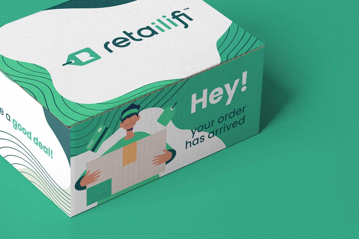
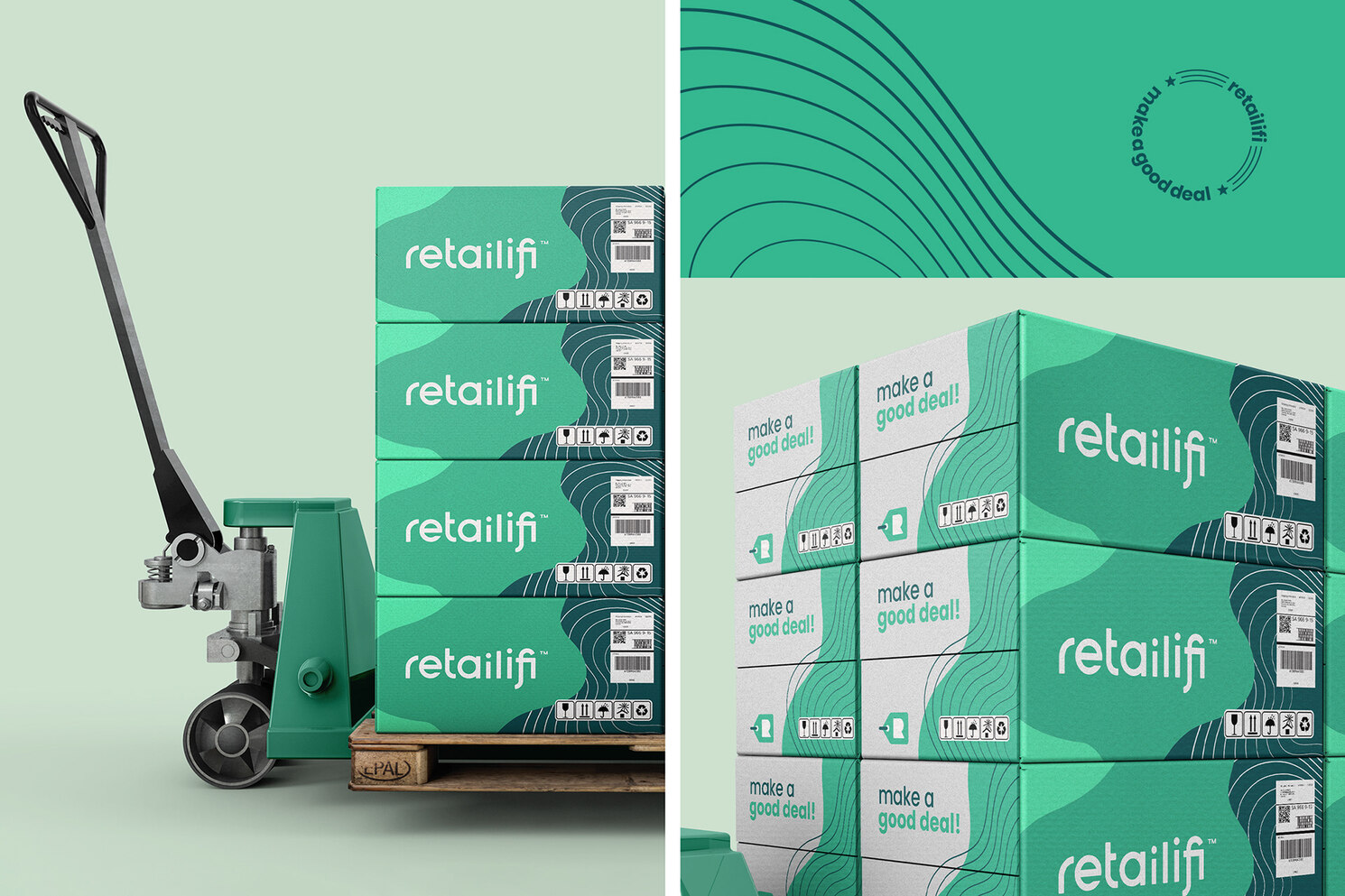
Green is a color that refers to balance and also refers to renovation. It represents stability and possibility. It is capable of transmitting growth, vitality and abundance or money, aspects that are consistent with the Retailifi brand and besides being the color of the predominant Pakistani flag.
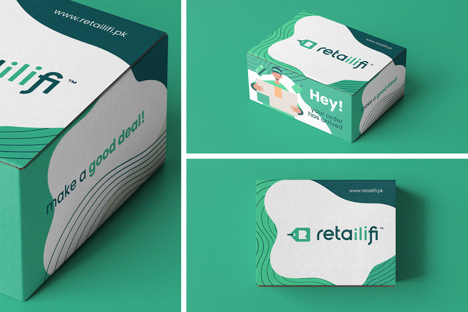
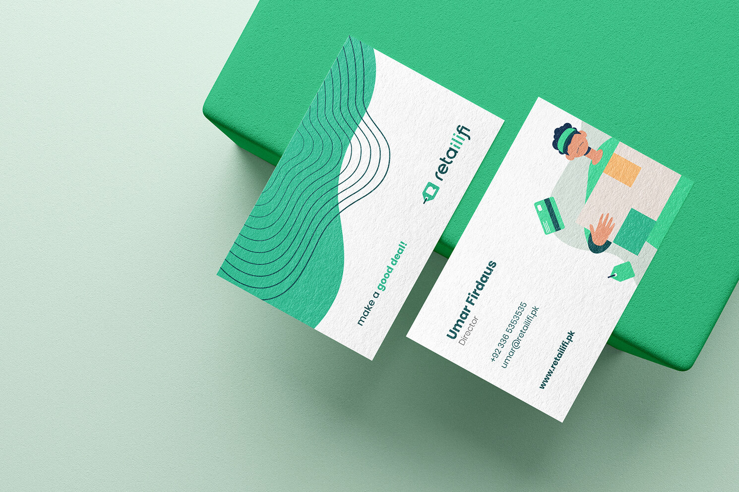
The symbol consists of a sales tag, because as the platform is made for both the buyer and the seller it would be ideal to represent the brand symbol for something common to both. The concept of wifi was used in the brand typography discreetly and not cliché way.


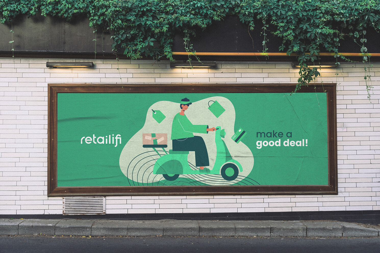
The illustrations refer to the reality of the e-commece in Pakistan, in this case, the purchase process, the delivery of the products, the handshake between buyer and seller. All have a minimalist, fun and popular look.
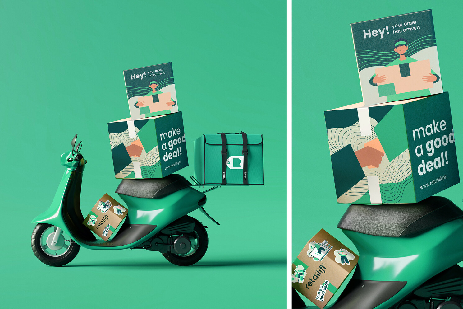
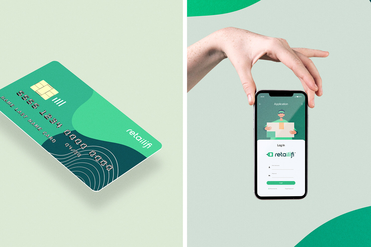
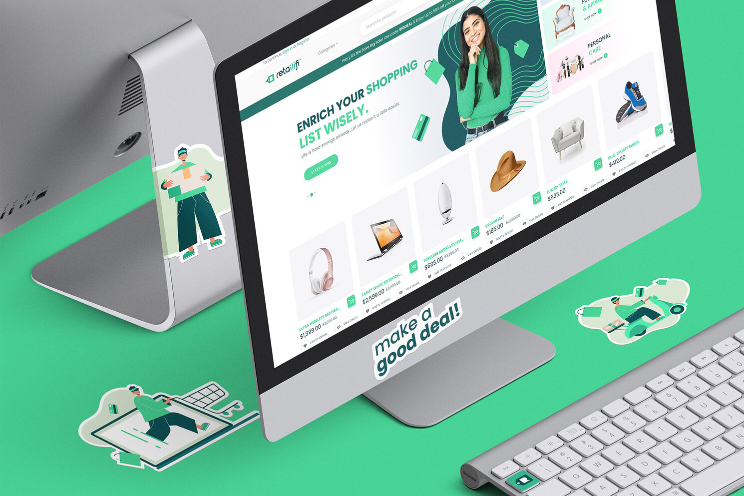
The phrase is linked to well-being and the shopping experience between seller, buyer and the Retailifi platform. After all, Retailifi's proposal is to create new connections and enable new business.
We use cookies to give you the best experience. Cookie Policy.
Accept