Let's start?
[email protected]
or use a form


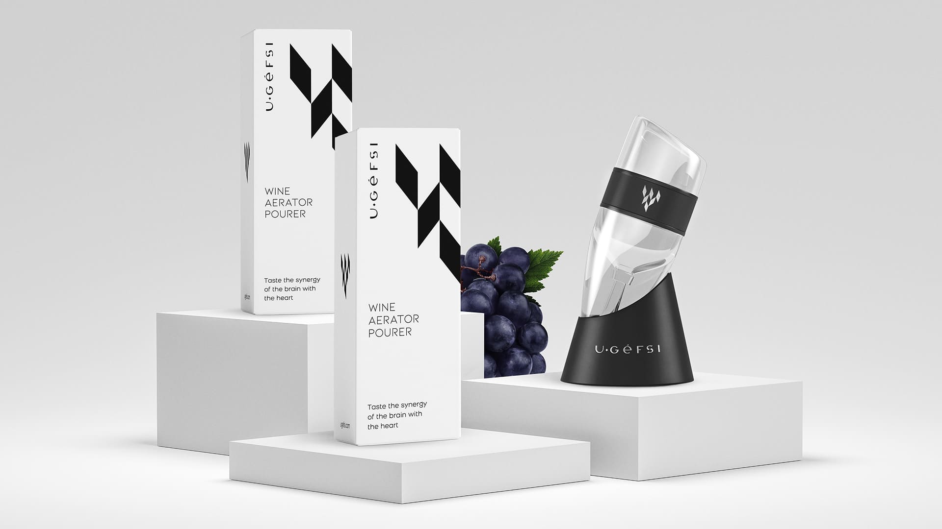
The brand sells several products for wine sampling with the aim of stimulating wine culture, strengthening and creating moments.

The purpose of U-gefsi is to involve people in tasting the culture of wine, offering multisensory experiences through the products sold, with the aim of relating flavor to moments of well-being that wine can provide, in addition to creating synergy between the brain and heart, stimulating memory, imagination and passion for drinking.
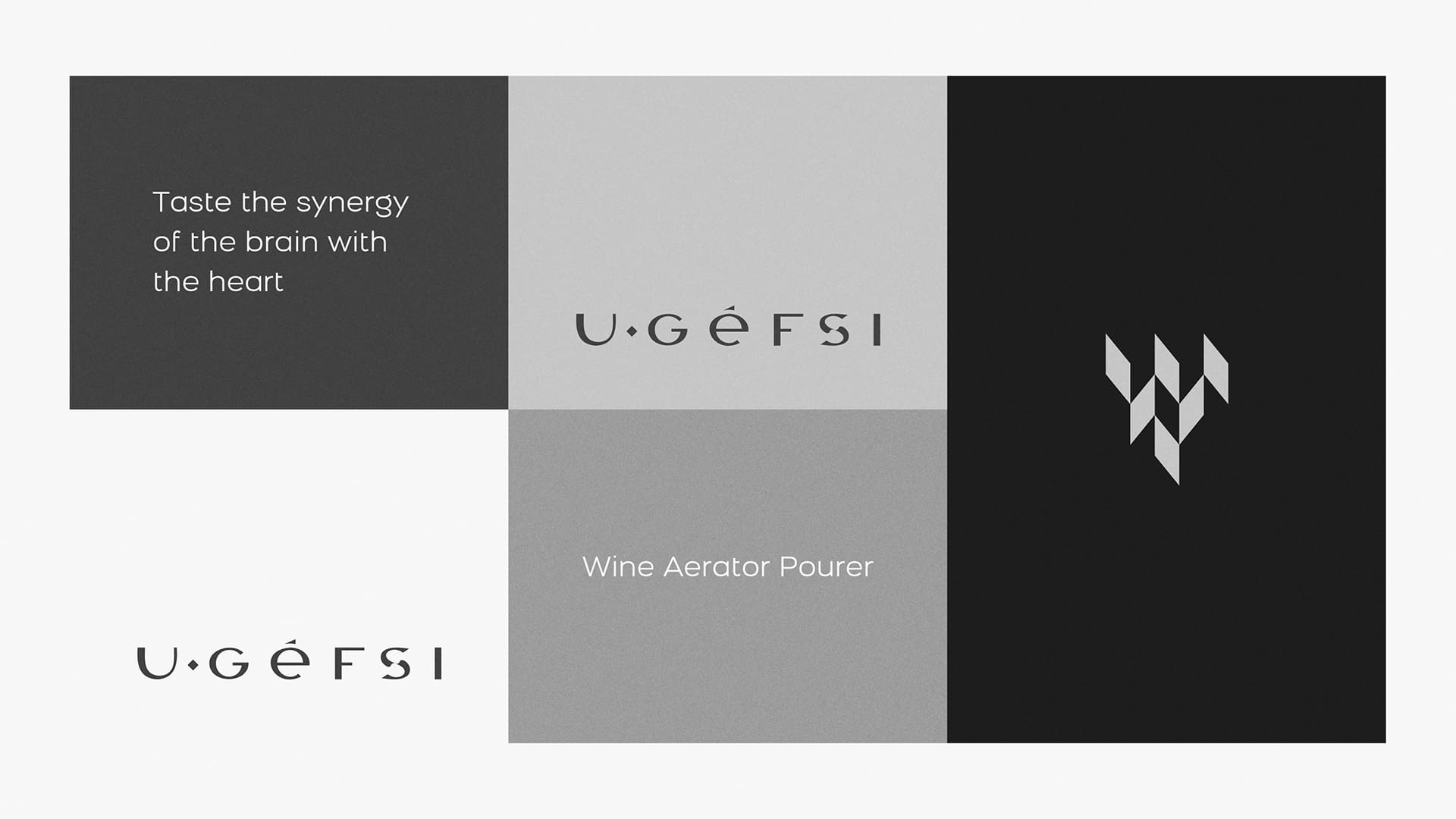
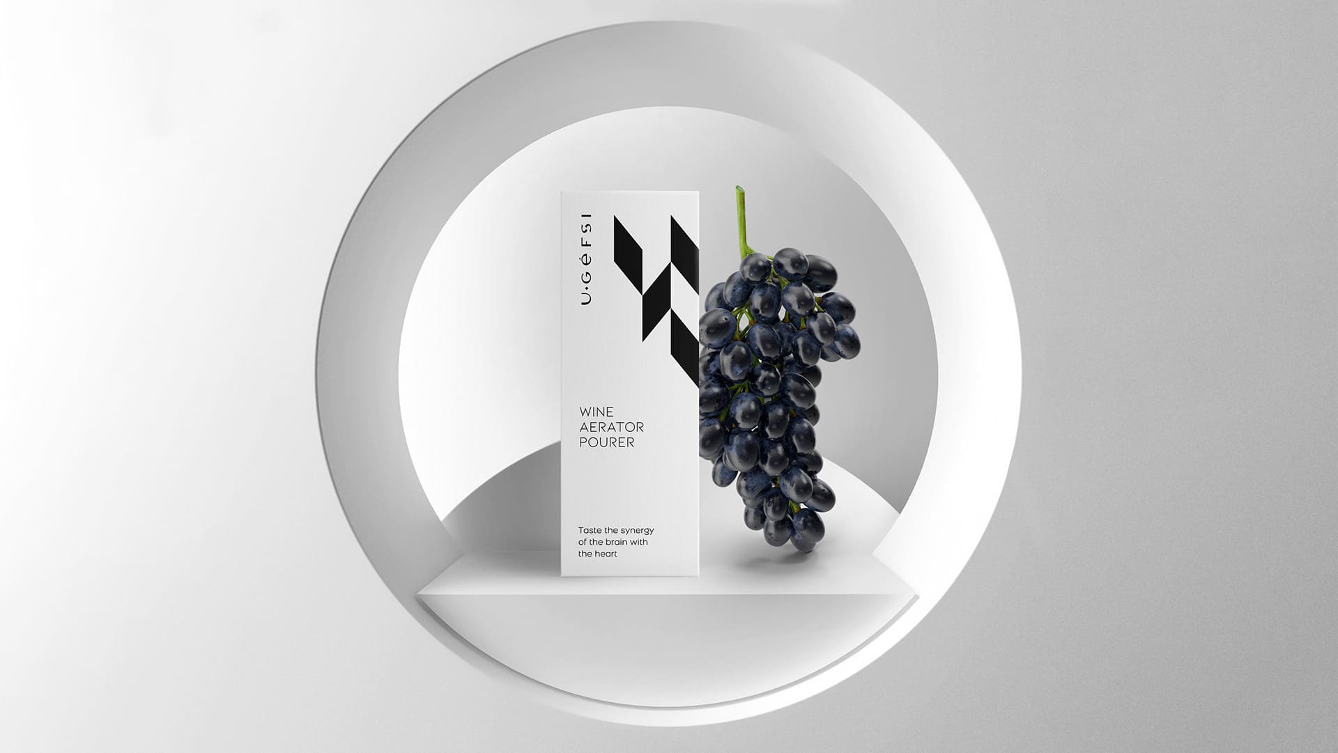
Grape is the basis of the entire wine culture, without the fruit nothing would exist. We created the grape symbol to represent the U-Géfsi brand, only in an abstract way and with rectilinear shapes, just to bring the silhouette of a bunch of grapes, making it more elegant to match a type of brand.
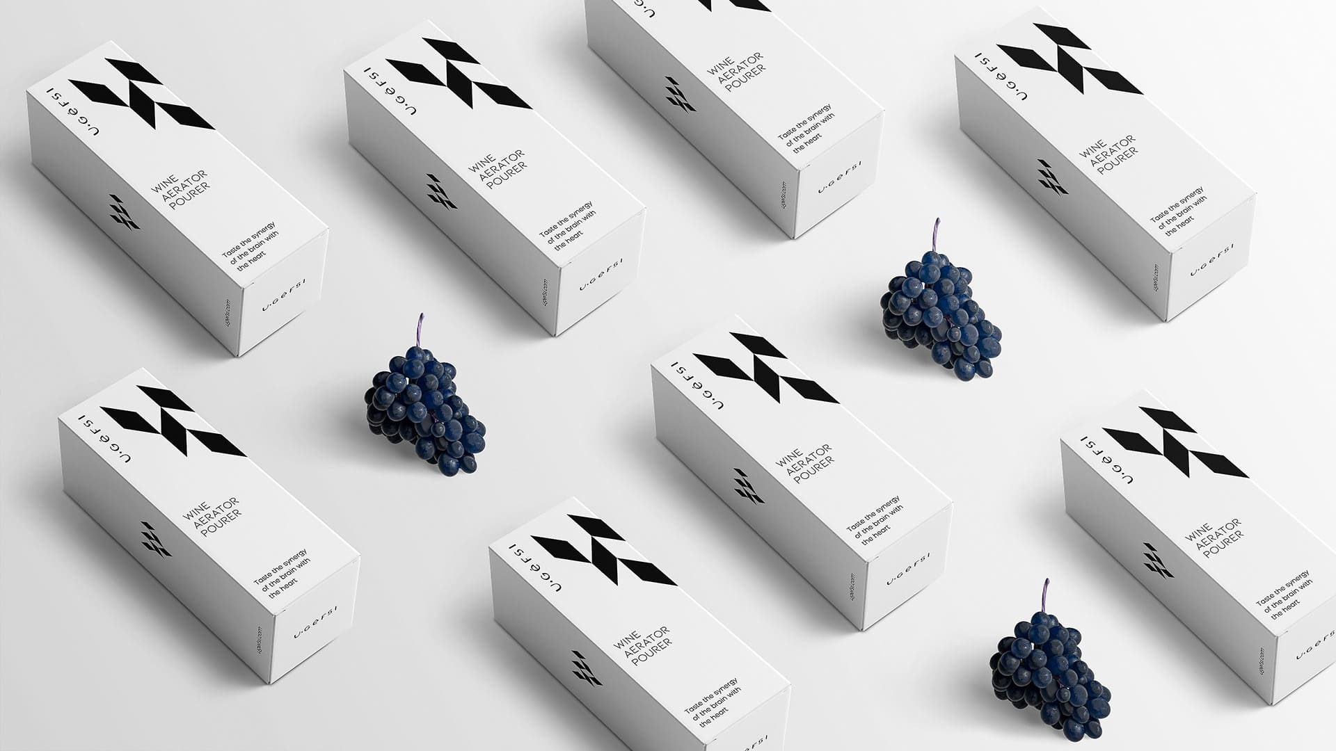
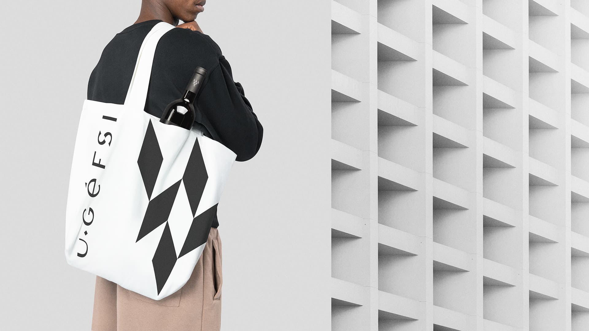
We also work on the concept of group and community since the purpose of the brand is to intensify the wine culture and for that it is necessary to create relationships between consumers.
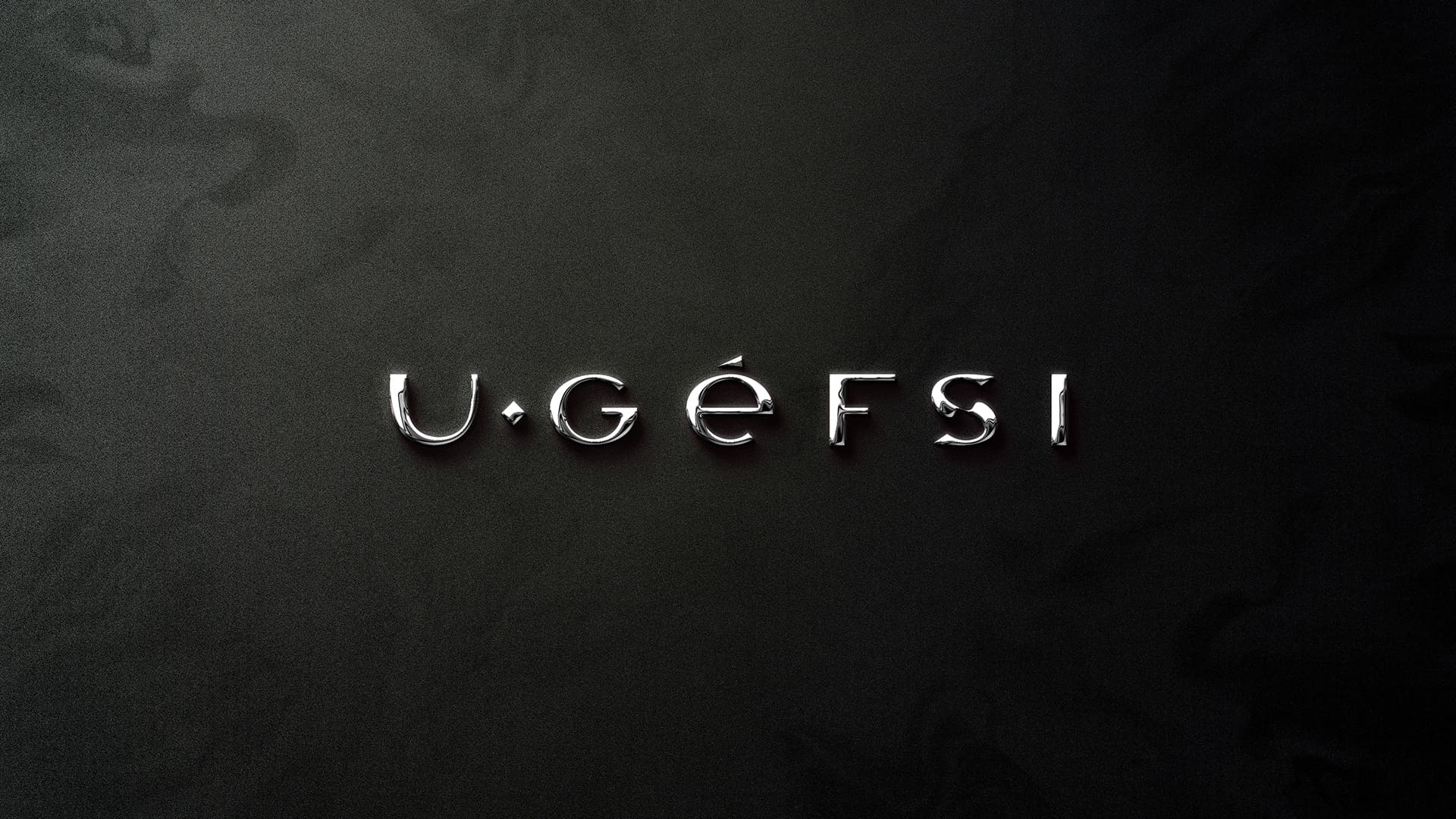
The letters were created to zero and thought to match the brand symbol. This typography and the chosen silhouette have a unique style. Optical adjustments were made between the letters to make reading more enjoyable. The letter S has more personality and the details simulate the waves of wine that happen in the glass.
[email protected]
or use a form
We use cookies to give you the best experience. Cookie Policy.
Accept