Let's start?
[email protected]
or use a form


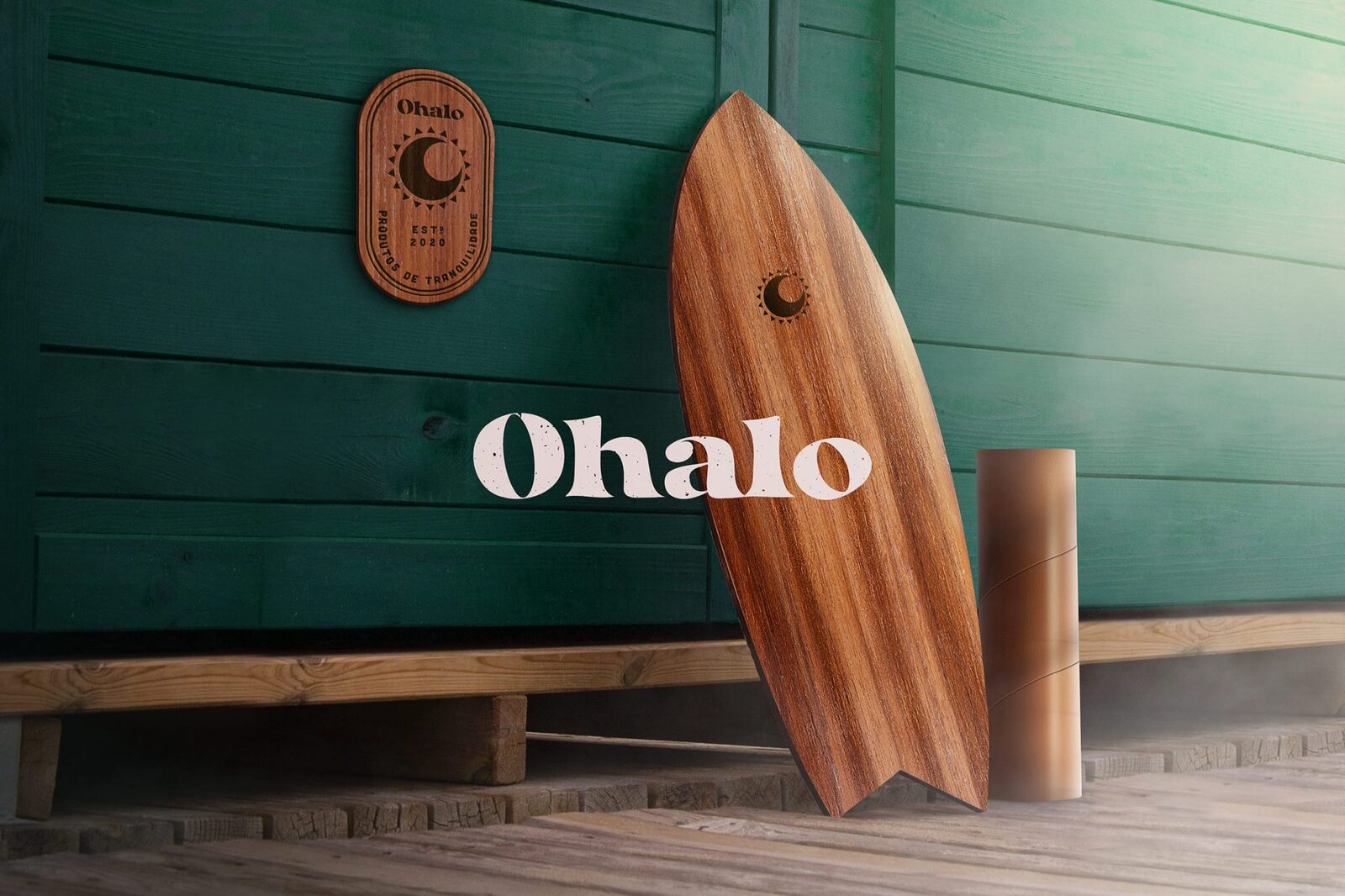
Its first and main product is the balance board. However, brand planning with launches that explore other categories, such as accessories for coffee and music.
The main attributes of the brand are balance and rusticity. With uncomplicated and welcoming products, which preserve textures and natural aspects of the materials used to produce them.
The name is composed by the junction of the letter "O" which bears a circular shape and evokes several etymological meanings: that of the Phoenician history, which was represented by an eye; chemistry, which represents oxygen; and Portuguese, which functions as an article or pronoun. Then added to the word "Halo", a natural circular phenomenon that forms a ring of light around the sun or moon.
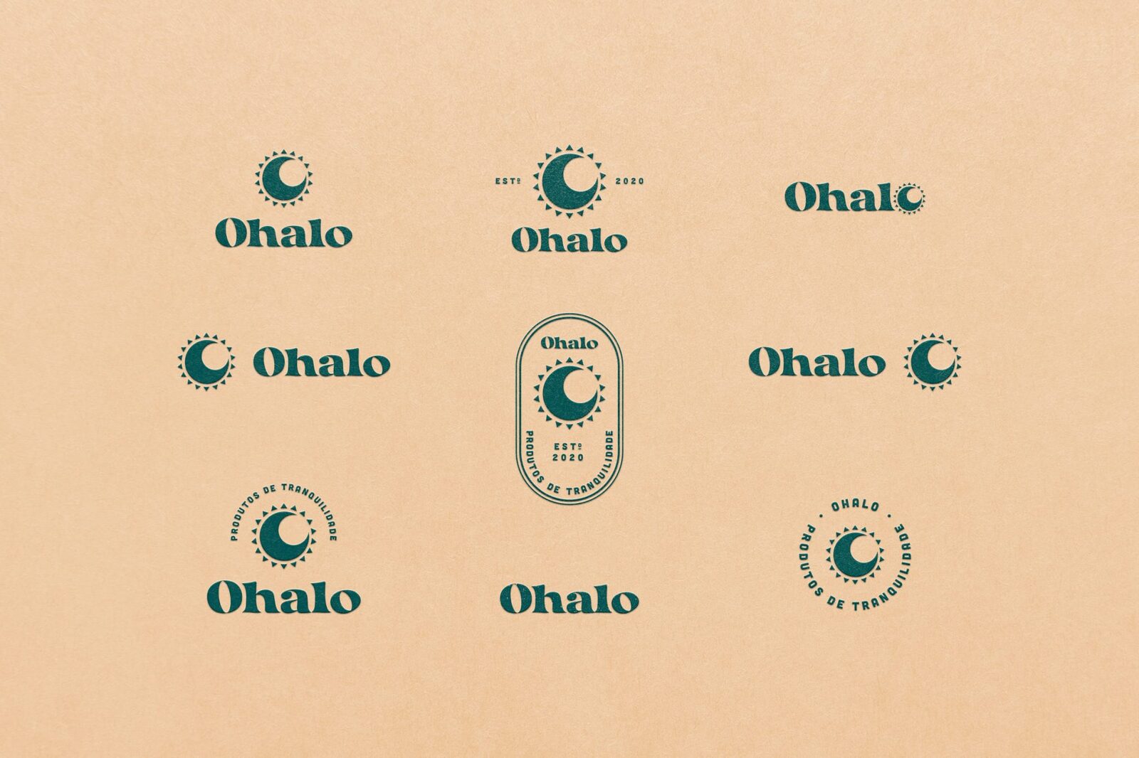

The symbol was created from the junction of the sun and the moon to represent the balance making contrasts: light and dark; cold and hot; ying and yang; perfect contrasts. The circles were made with a golden ratio and the angle between them is 22º according to the angle of the crystals for the appearance of the phenomenon. As it is a handmade product and there is also a variation of colors from the angle of the crystals, some optical adjustments were also made in the composition of the symbol to bring the concept "made by hand".
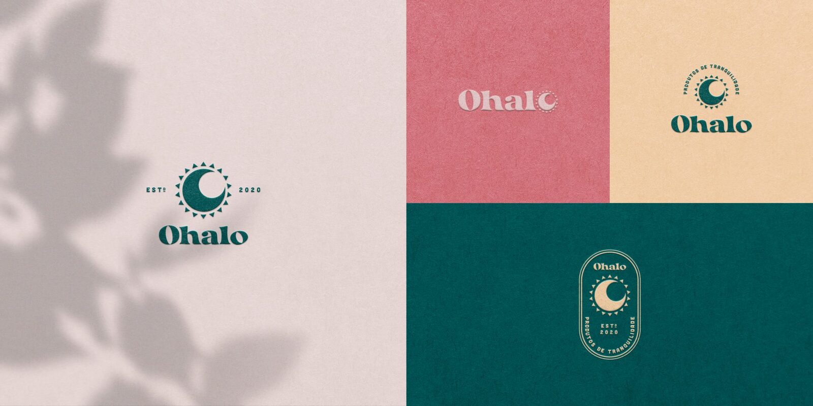
Ohalo's proposal is to bring lightness and tranquility to people's day, enabling experiences that permeate both physical and mental health.
The brand's speech brings with it a conscious and honest gratitude, without hyperbole. Ohalo believes that the balance of body and mind is the way for positive changes to happen.
Halo is a ring of light that surrounds a celestial body, sun or moon, a natural phenomenon that appears when light is reflected and refracted by millions of ice crystals, at an angle of 22º in the atmosphere, and can be divided into colors by account of the dispersion, colors very close to the rainbow.






[email protected]
or use a form
We use cookies to give you the best experience. Cookie Policy.
Accept