Let's start?
[email protected]
or use a form


The company has a professional with over 12 years of experience in the market. The differential of Farol Azul is that it is able to connect people and properties in a personalized way, focusing on the needs of each person, that is, through a customized case study.
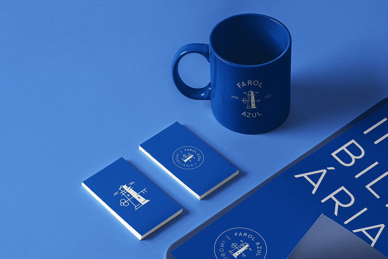
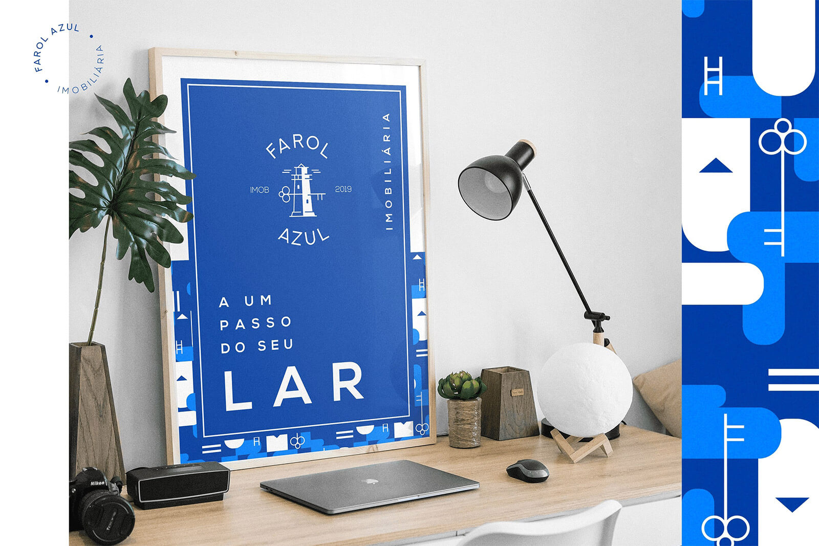
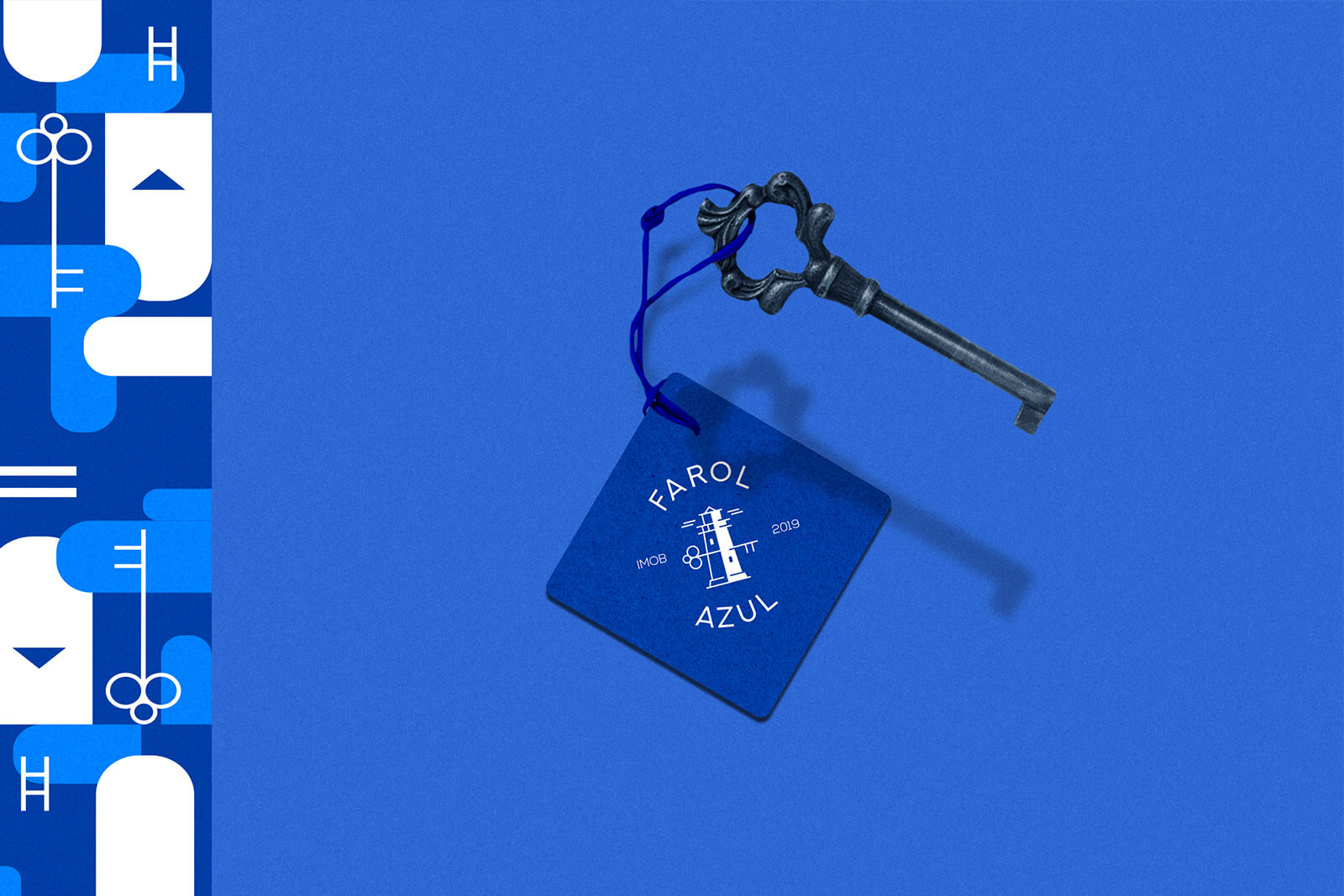
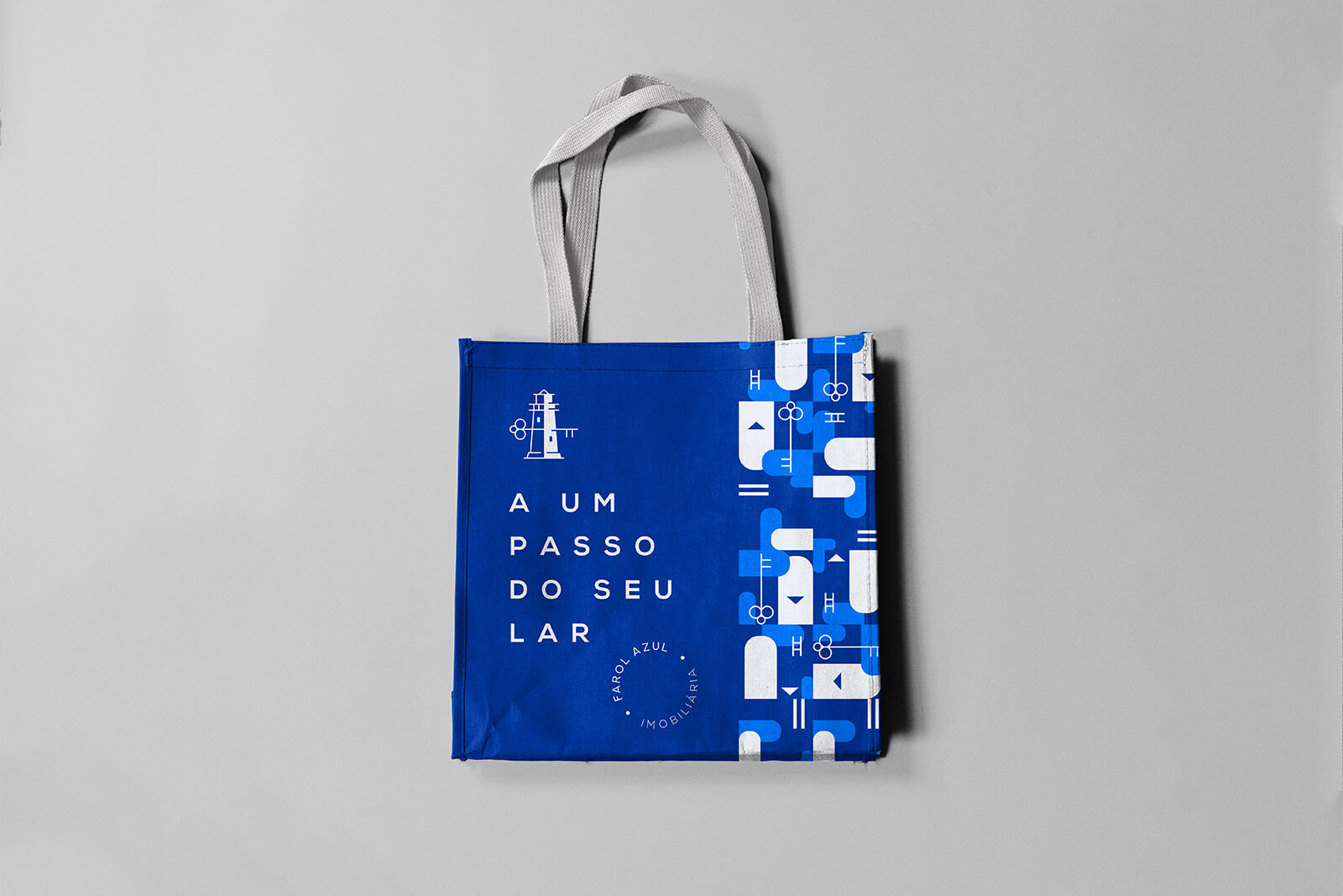
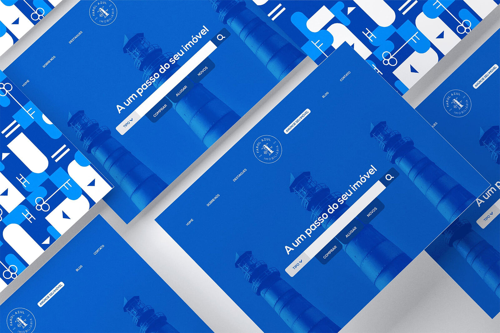
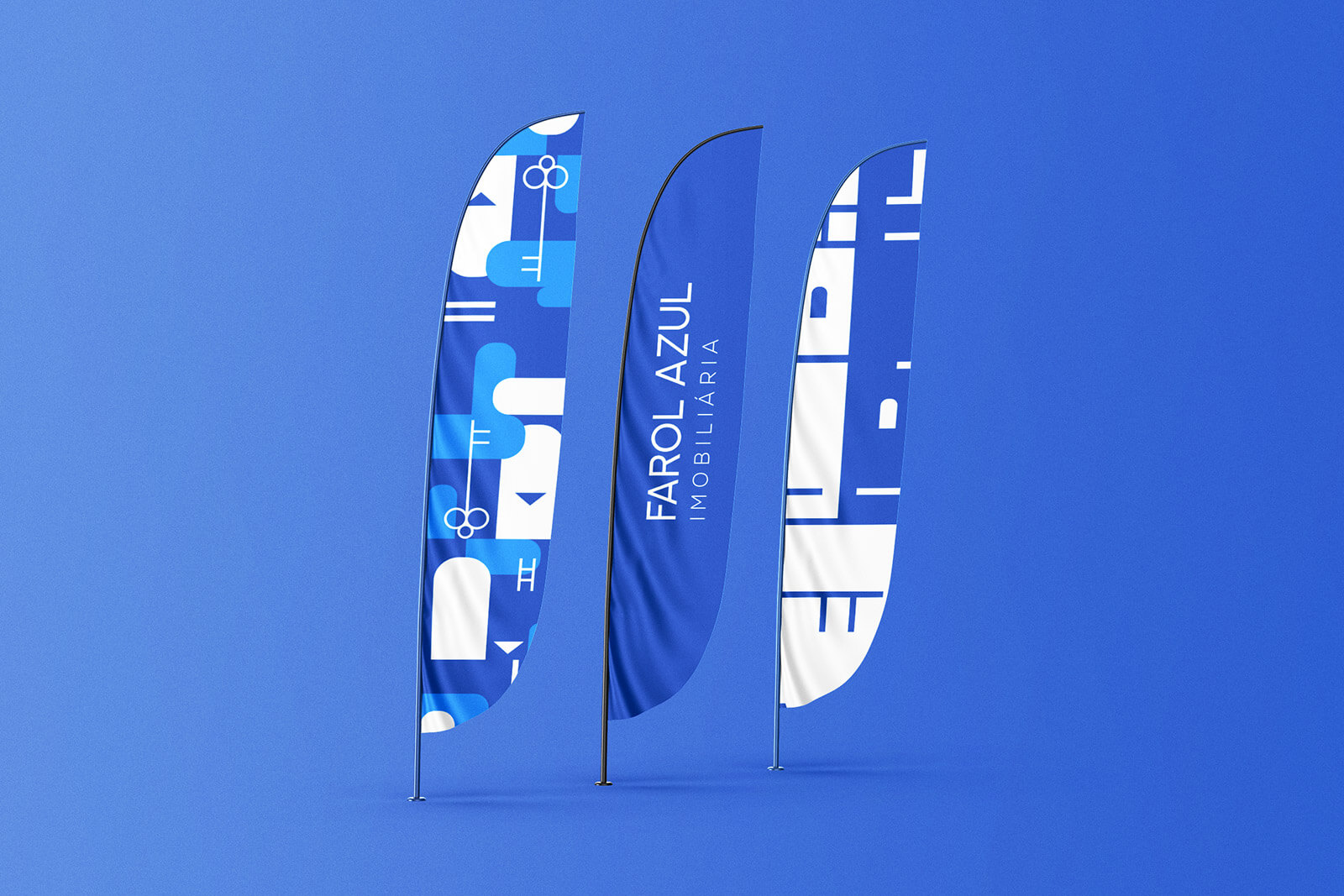
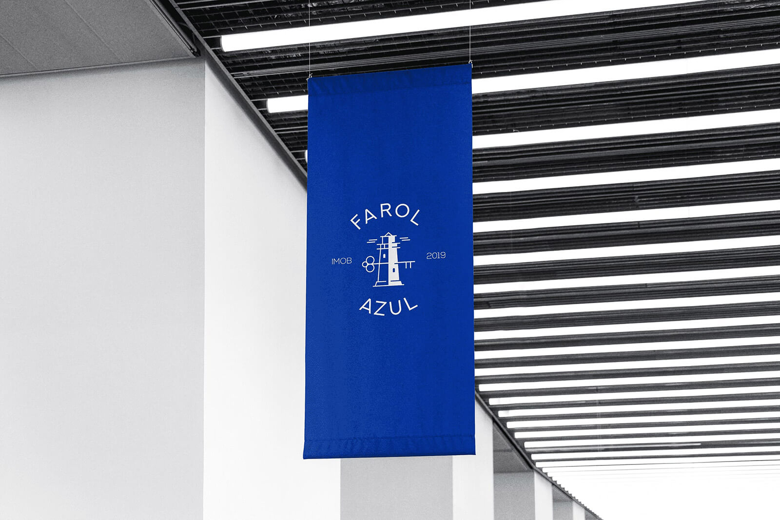
Because of the name of the real estate company, we had already defined that the symbol would be a blue lighthouse. The client wanted the symbol to refer to the real estate sector and suggested a house. We then decided to use a key in the construction of the lighthouse symbol and at the top of the design we chose the house-shaped roof. Another great challenge was working on the brand without looking like a phallic symbol.
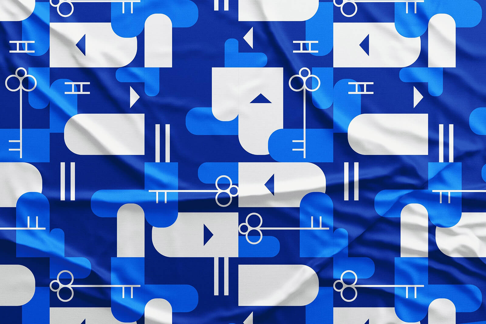
The lighthouse is a strong symbol, iconic, very presente in people’s mind. Besides being reference architectural object, it also has several meanings, such as:
Direction, instruction, security, right way, way home. The symbol consists of intangible meanings that are associated with real estate business, which is to instruct and guide people and companies for good business in the market.
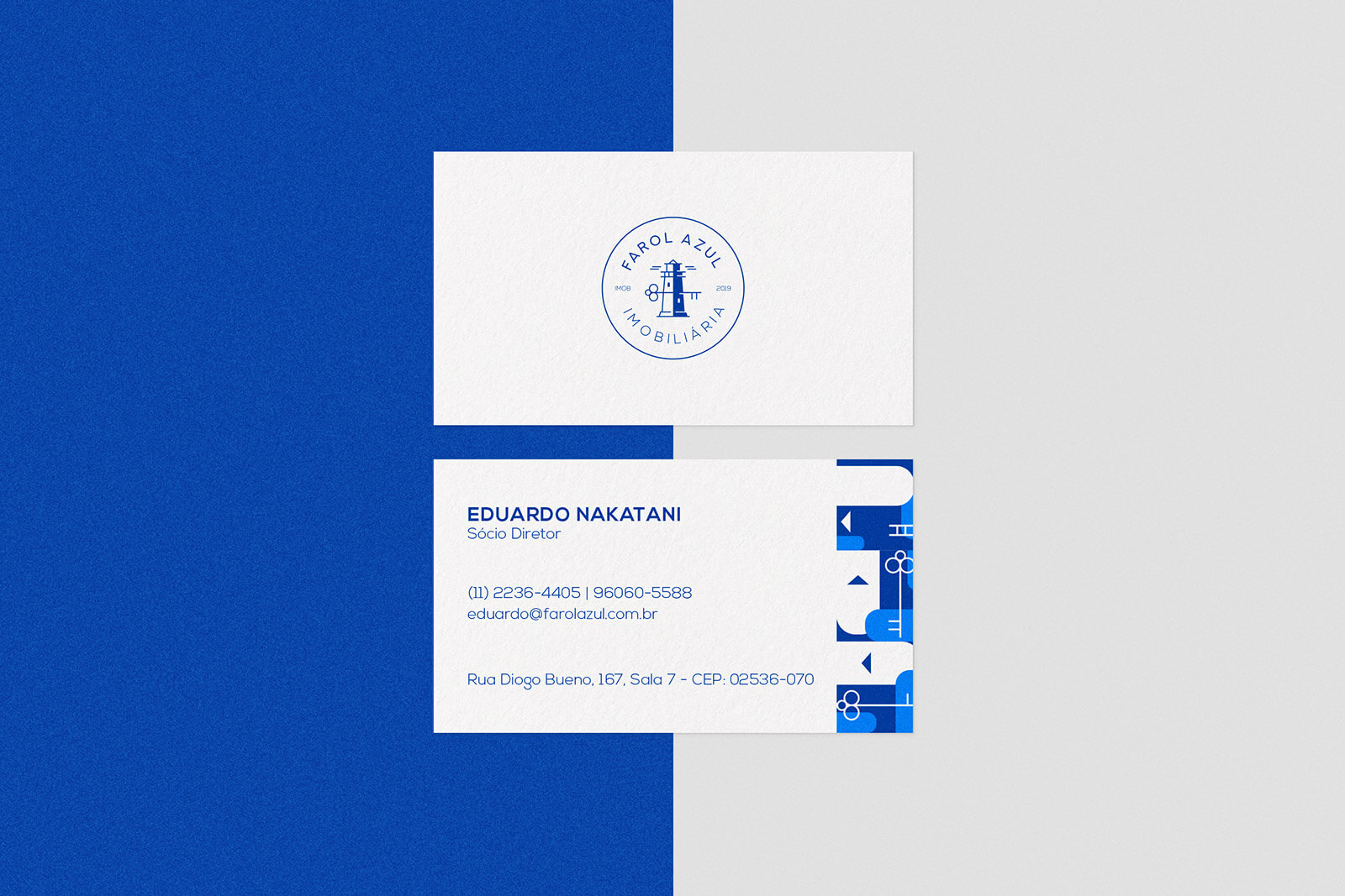
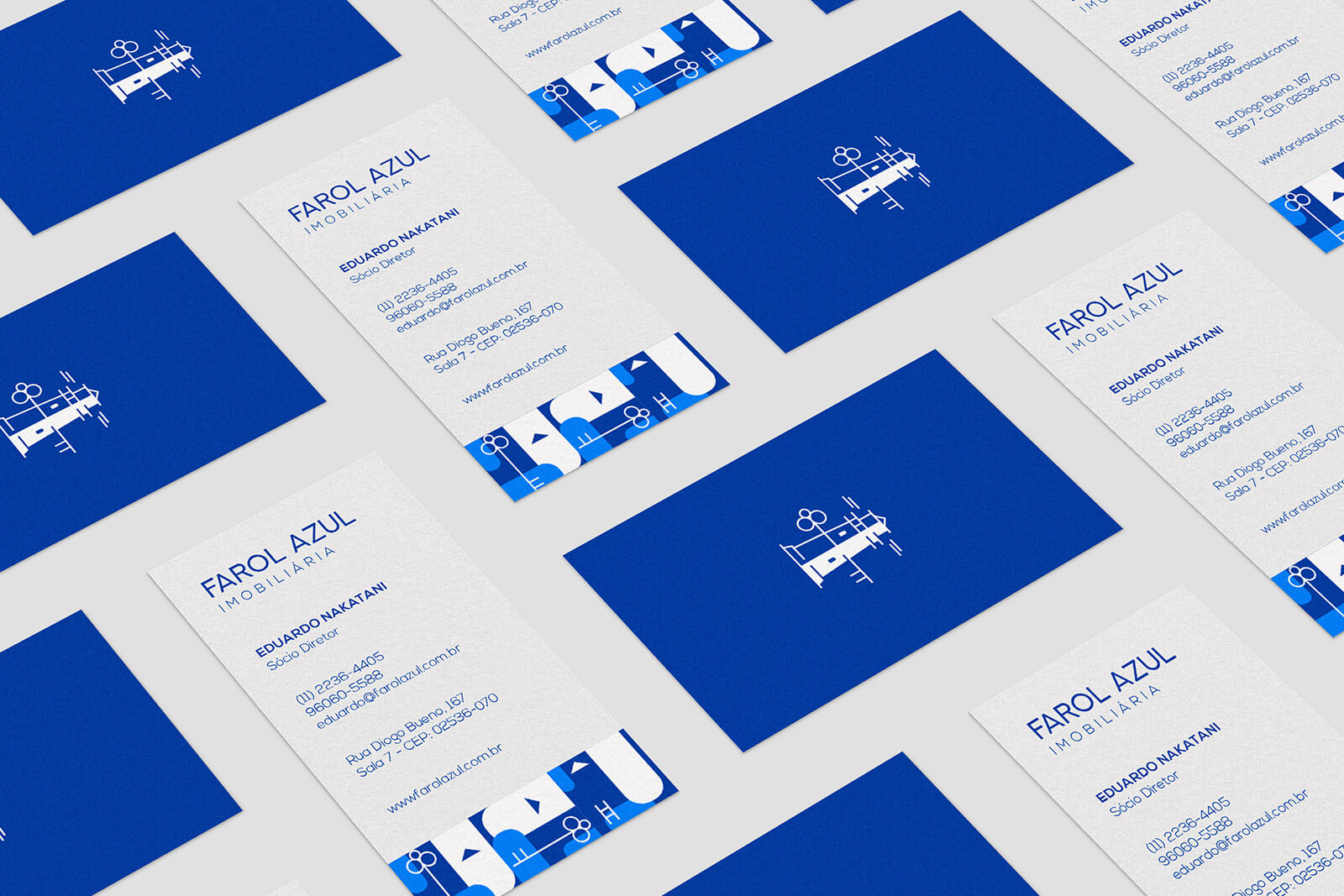
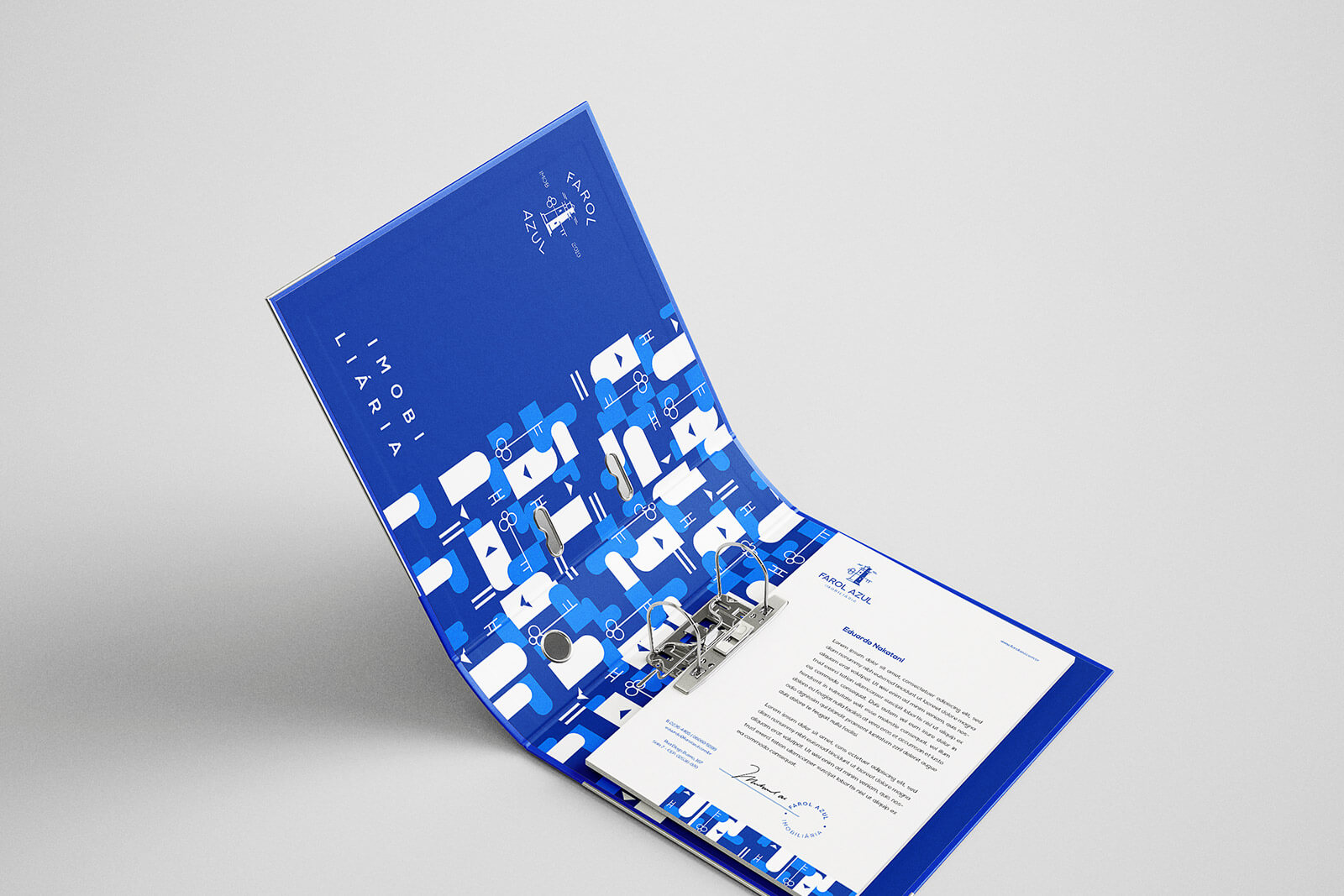
The blue is also represented in the brand and acts as a reinforcement, being also the preferred color among men and women. It’s color has able to of transmitting sensations such as: Security, confidence and credibility.
[email protected]
or use a form
We use cookies to give you the best experience. Cookie Policy.
Accept