

 Prev projects
 Go to top
Let's start?
[email protected]
or use a form


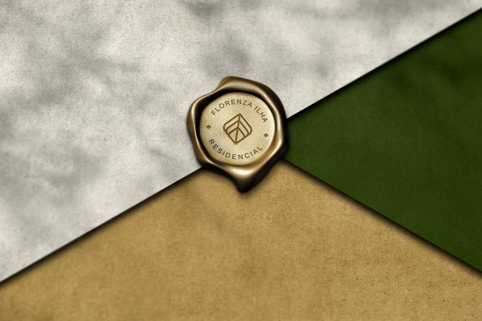
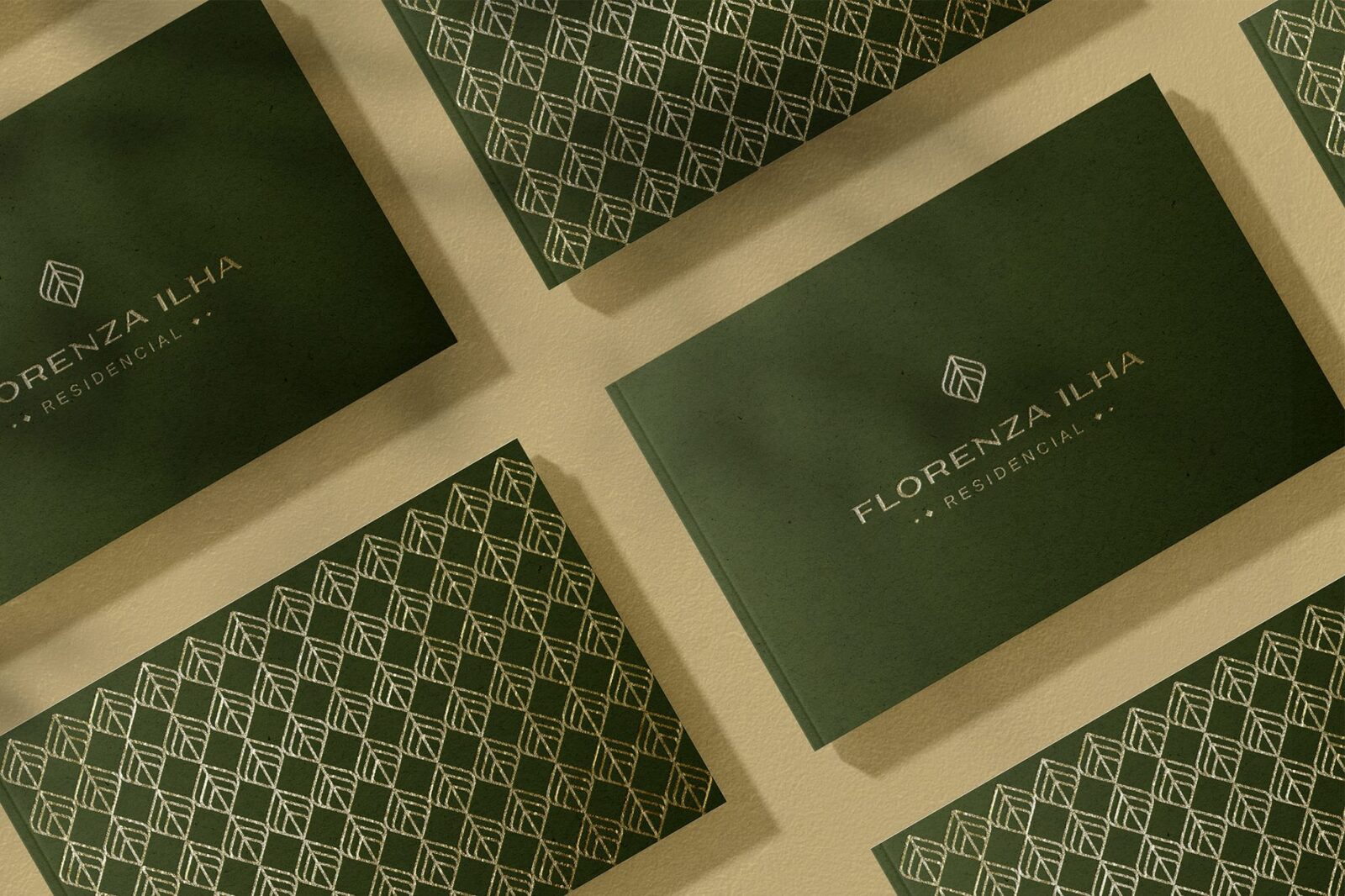
The island of Guaratiba is a region rich in nature, surrounded by the Atlantic forest and because it is a more important place in the great bustling center of Rio de Janeiro, we decided to bring the regional essence into the brand project. The symbol was made inspired by a common wild plant in the region called "Monstera Adonsonii".
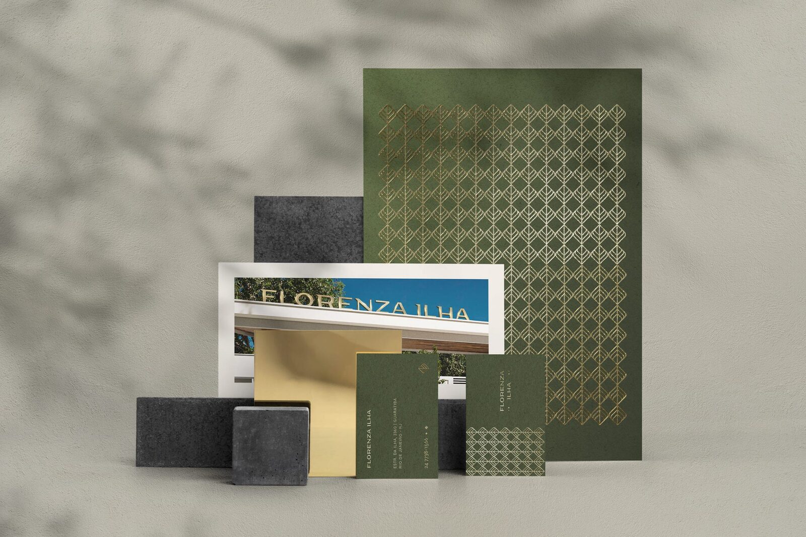
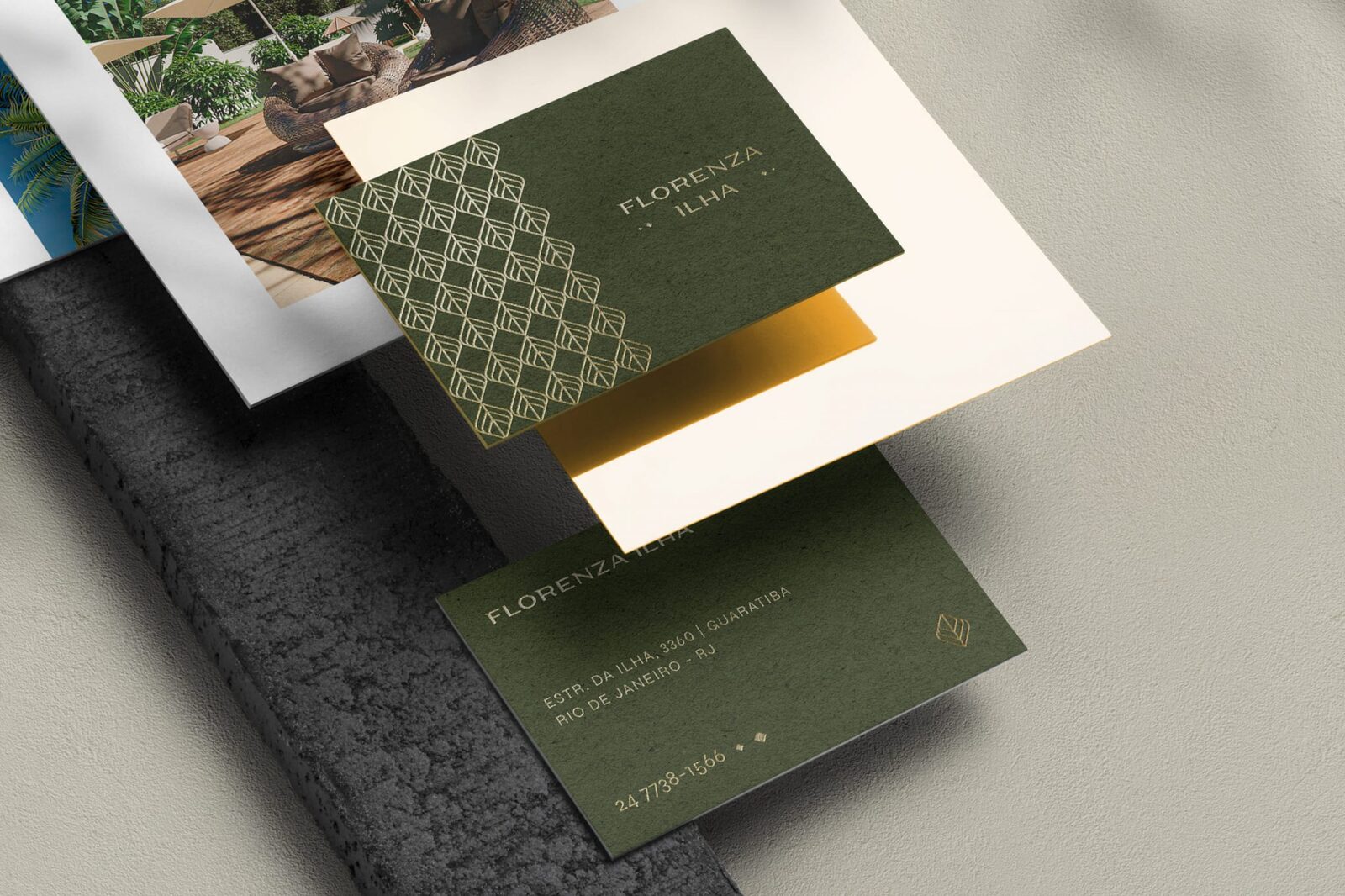
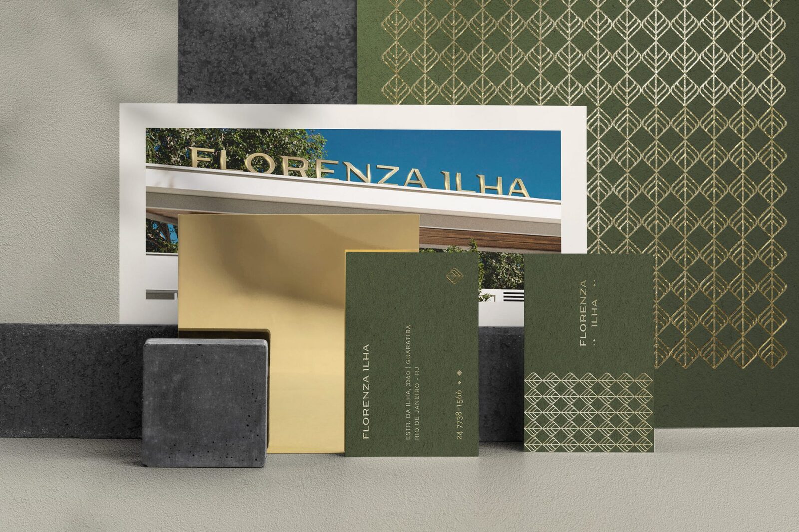
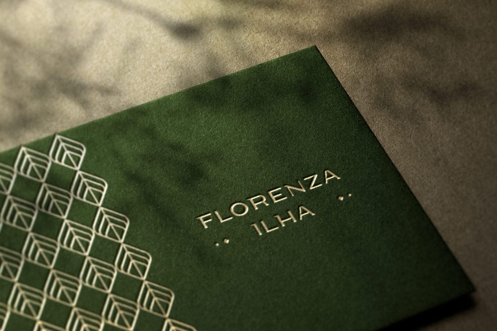
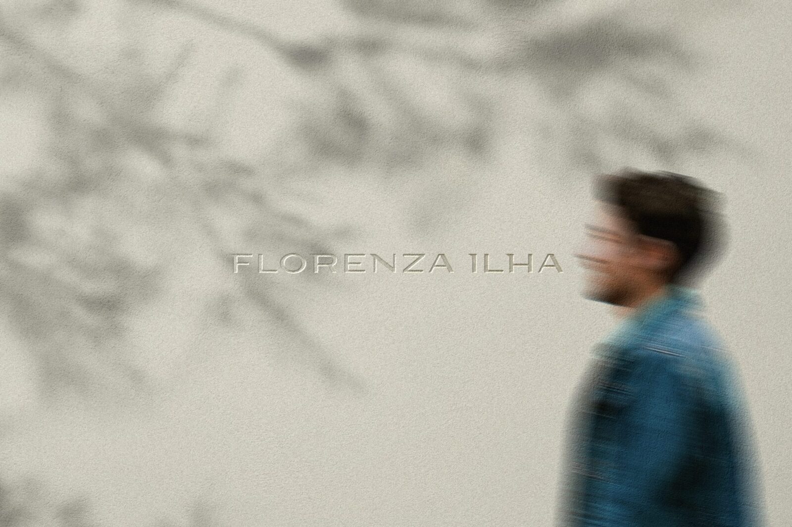
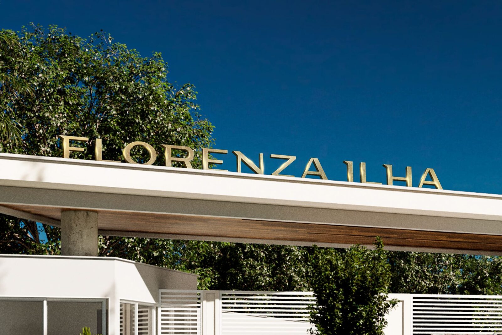
The Florenza Ilha brand typography should refer to something sophisticated because it is a high-end residential, but it should also have characteristics related to nature and convey an organic essence. We also represent these concepts through the colors and textures of the visual identity.
[email protected]
or use a form
 Contact us
We use cookies to give you the best experience. Cookie Policy.
Accept